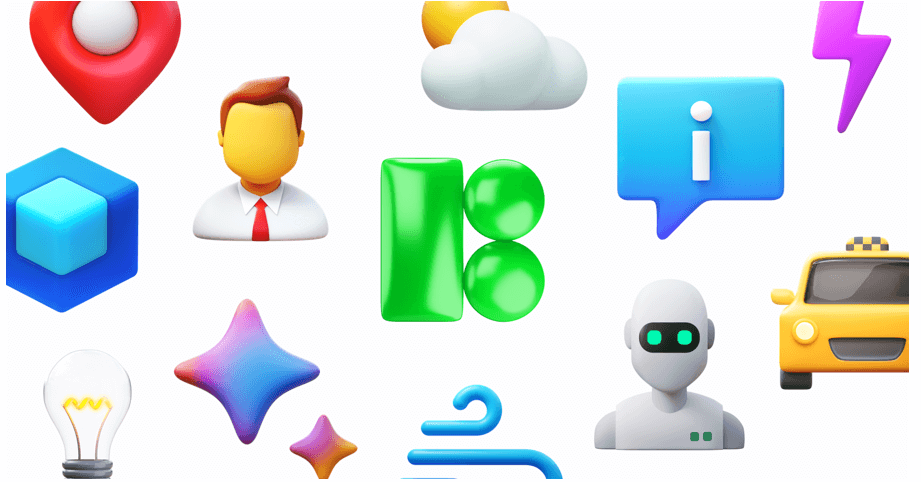
For product teams and designers, the headache isn’t finding an icon. It is finding five hundred icons that look like they belong to the same family.
You might find a perfect “home” icon in one open-source pack. But look closer. The “user” icon in that same pack looks slightly off, and the “settings” cog is missing entirely. This fragmentation forces teams into a corner. You either build icons in-house-a massive resource drain-or you cobble together mismatched assets that degrade the user interface.
Icons8 solves this by operating not as a marketplace of scattered uploads, but as a manufacturing plant.
With over 1.4 million icons produced by a centralized team, the platform focuses on strict adherence to specific design languages. Whether you build for iOS, Android, or a custom web interface, the library is deep enough that you never have to switch styles halfway through a project.
Standardizing Multi-Platform App Development
Imagine a product team launching a finance application on iOS, Android, and Windows simultaneously. The brief requires the app to feel “native” on every platform.
In a typical workflow, this demands three distinct icon sets. Finding three open-source libraries that cover every necessary financial concept-from “wire transfer” to “recurring payment”-is nearly impossible.
With Icons8, the design lead grabs specific style packs that correspond to the operating systems. For the iPhone version, they select the “iOS 17” style. It’s available in Outlined, Filled, and Glyph variants. This pack alone contains over 30,000 icons, ensuring that even obscure banking actions have a representation that adheres to Apple’s Human Interface Guidelines.
For the Android build, the team switches the library filter to “Material Outlined.” These 5,500+ icons follow Google’s Material Design specs regarding corner radius and stroke width. Finally, for the desktop admin panel, they employ the “Windows 11” pack.
Here is the key advantage.
Because the same internal team draws these icons, the visual metaphor remains consistent even as the style changes. A “wallet” looks like the same concept across all three packs, just rendered to fit the specific OS guidelines.
The team integrates these assets directly via the Figma plugin. They drag vector instances into their mockups without ever leaving the design environment. When developers take over, they export the exact SVG or Lottie JSON files required for each codebase. The native feel remains intact without anyone drawing a single vector path manually.
Rapid Prototyping for Marketing and Web
Marketers and web developers often face a different challenge. They don’t need OS compliance. They need visual impact and speed.
They require a cohesive set of icons for feature grids, pricing tables, and navigation menus.
A user starts by creating a Collection in the Icons8 interface. As they browse, they drag relevant icons-a rocket for “speed,” a shield for “security,” a headset for “support”-into their collection. A common issue arises here: the default black icons clash with the dark blue brand palette of the landing page.
Downloading assets to recolor them one by one in Photoshop is a waste of time.
Instead, the user applies the bulk recolor feature within the Collection tool. They paste the brand’s specific hex code, and the entire set updates instantly. If a specific icon feels too thin, they use the in-browser editor to add a stroke or a background shape, like a rounded square, to give it weight.
Once the set is ready, implementation is fast. For the live site, generating CDN links or Base64 HTML fragments allows for direct embedding, reducing server requests. For the stakeholder slide deck, the user downloads the set as high-resolution PNGs (up to 1600px on paid plans).
The visual language remains uniform across the web and the presentation deck. You achieve in minutes what used to take hours.
A Designer’s Workflow: The Pichon Experience
Jalen, a UI designer, starts his morning working on a dashboard interface. He keeps the Icons8 Mac app, known as Pichon, running in the background. He doesn’t open a browser. He simply hits a hotkey to bring up the Pichon window.
He needs a specific icon for “data analytics.”
He types “chart” into the search bar. Results populate instantly, filtered by the “Office” style he selected for this project. He spots a line graph icon that fits but notices it lacks a specific node he wants. He drags the icon directly from Pichon into Illustrator.
Since he has a paid plan, the asset drops in as an editable vector. He ungroups the paths, tweaks the node, and drops it into his layout.
Later, he needs to add a reaction interface to a comment section. He switches the category to emojis to find a set of expressive, consistent faces that match the dashboard’s clean aesthetic.
Toward the end of the day, he hits a wall. He needs a very specific icon: a “drone delivering a pizza.” It doesn’t exist in the library.
He opens the Request feature. Seeing similar requests, he adds his vote. He knows that if it reaches 8 likes, the Icons8 team will put it into production. For now, he uses the “Recolor” tool to combine a drone and a pizza box icon temporarily. His flow stays uninterrupted.
Comparison With Alternatives
Icons8 vs. Open Source (Feather, Heroicons)
Open-source packs work well for small, simple projects. They are free and lightweight. But they lack depth. A pack like Feather might have 200 icons. If you need a “user” icon, you are set. If you need “user-database-error,” you are out of luck. Icons8’s library of 1.4 million assets solves the “missing icon” problem that plagues open-source libraries.
Icons8 vs. The Noun Project
The Noun Project is a marketplace where thousands of different designers upload work. While it has immense variety, it lacks consistency. You might find five styles of “dog” that look completely different. Icons8 creates assets in-house. This means the stroke width, corner radius, and visual weight are mathematically consistent across a style pack.
Icons8 vs. Flaticon
Flaticon is the closest competitor in terms of volume. The main distinction lies in focus. Icons8 leans heavily into software development and OS guidelines (Windows 11, iOS 17, Material), making it suitable for UI/UX designers building applications. Flaticon often leans more towards illustrative and decorative styles for graphic design.
Read also: Revolutionizing Sleep with Modern Technology
Limitations and When This Tool is Not the Best Choice
Vector Paywalls
If you are on a strict zero-budget project, Icons8 has friction. The free plan allows PNG downloads up to 100px. This works for mockups, but for modern retina displays or responsive web builds, you need SVGs. Those are locked behind the subscription (except for specific categories like Popular or Logos).
Style Lock-in
While the library is huge, the distribution isn’t equal. The “iOS” and “Windows” packs have tens of thousands of icons. Niche styles, like “Liquid Glass” or “3D Fluency,” have significantly fewer (2,000–3,000). Committing to a unique style for a large application carries a risk: you might eventually hit a wall where a specific metaphor hasn’t been drawn in that style yet.
Attribution Requirements
The free tier requires you to link back to Icons8. For internal tools or student projects, this is fine. For client work or white-label enterprise products, having a mandatory attribution link in the footer is usually a dealbreaker. This forces an upgrade to a paid plan.
Practical Tips for Power Users
Leverage “Simplified SVG” Settings
When downloading an SVG, look for the “Simplified SVG” checkbox. By default, this is checked to reduce file size. But if you plan to animate the icon or edit the paths in Illustrator, uncheck this. It preserves the original structure and layers, making modifications much easier.
Use Visual Search for Abstract Concepts
Sometimes you know what an icon looks like, but not what it is named. The “Search by Image” feature is surprisingly robust. Upload a rough sketch or a screenshot of an icon from another site. The AI will find the closest match in the Icons8 library.
Embed for Speed, Download for Production
During the development phase, use the Base64 or CDN link options to drop icons into your code immediately. It keeps your repository clean. Once the design is locked, download the optimized SVGs to host locally. This ensures no external dependencies affect your load times.
Check the “Popular” Category for Free Vectors
If you need vectors but have no budget, browse the “Popular,” “Logos,” and “Characters” categories. Unlike the rest of the site, these often allow SVG downloads without a paid subscription, provided you include attribution.